I started working with Artmap Inc in 2016. At the time they ran a series of online publications on Medium’s platform.
My task was to re-brand all their publications and to bring them in line with one another, keeping them all distinct yet similar enough to feel like they are all part of the same company.
By looking at Medium and what tools were available how could this be used to create an efficient brand with this limited tool set. It was clear that using a square logo would be best, coupled with a long banner format to make the best use of the space, also integrating key colours into the individual publications would be possible, and a subtle way for maintaining brand identity throughout a page without extensive graphics bloating the experience.
With that in mind I started working through rough ideas for each of the identities.
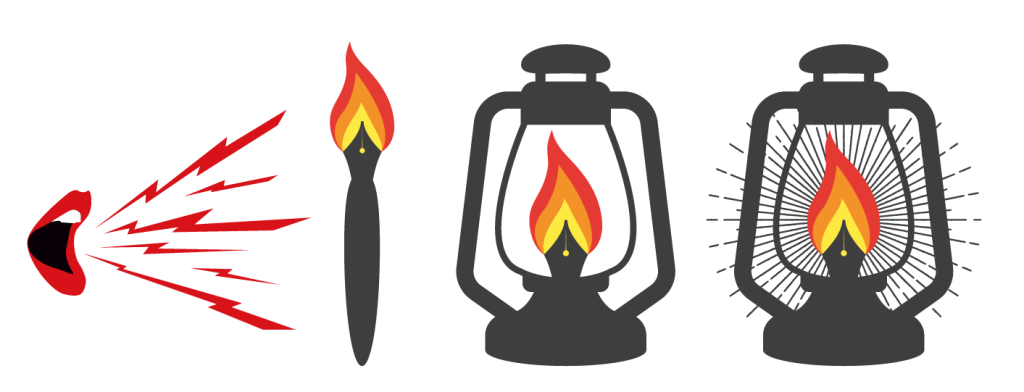

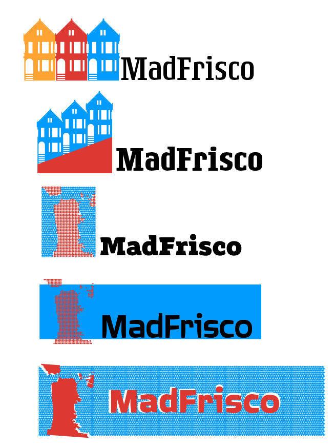
At this point I was conscious that these designs all needed to be part of a family. To create this I started to set all the elements within a strict grid to create a uniform set of designs, all with the same colours plus one (or two) key colours.
The final result is a family of designs that all work on their own and also fit together with a common thread of design.
This brand already had an established logo and visual ID, so I simply redrew the logo to give us some clean files to work with then reformatted the layout to fit the new style guide.

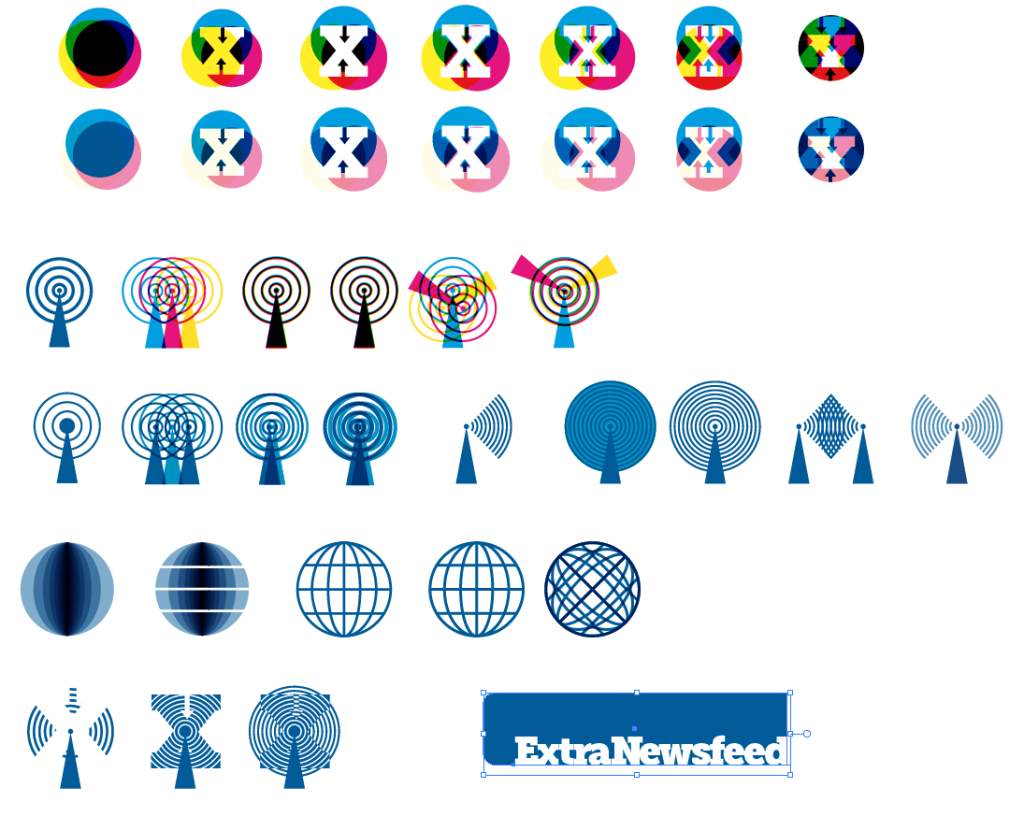
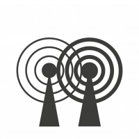
The client wanted to reflect a sense of vintage radio broadcasts mixed with modern connectivity, the final logo is stylised anthropomorphic figures based on the image of radio towers.



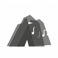
I wanted to use the idea of festivals, tents and music festivals.
By layering up transparencies of mountains, it creates this tent shape in the middle. A flag and some music notes finish the logo.



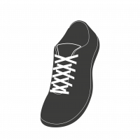
The analytics for this brand was that most of the users were women and engaged in sport/fitness. With that in mind, I looked at women’s sportswear and using a sample of 100 different top-selling products I took an average colour sample.



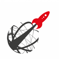
I wanted to capture a sense of vintage travel. Looking back to visions of the future from the 50s and 60s I created a logo based on this utopian vision of future travel.


The colour for this one was set by the client, which reminded me of using green monochrome computer displays. This lead me on to scanning ray tubes and pixel grids.
I created the pixelated type for this first and went on to create the watch motif in the same style.



As this was a politically charged brand, at the intersection of politics and healthcare, so too is the logo. Using elements of the US flag as pills.


The colour of this is the same as that of the iconic dollar bill.
The logo itself is formed of interconnecting nodes, reflecting both the internet and financial institutions.




The name comes from a scene in Ace Ventura regaling how mistakes were made and a game was lost.
The logo is based on the cookies in that scene and the logo is directly taken from the spray painted background in another scene.


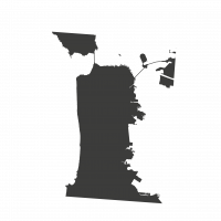
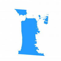
I wanted to capture the vibrancy and character of San Francisco.
I used the colour of the Golden Gate Bridge, International Orange #F04A00, as the base for the palette.


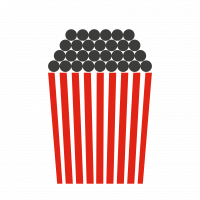
This was simply a play on traditional movie theatre Popcorn.


The colour was from a Spalding regulation ball.
The logo itself was inspired by various sports logos, though this time showcasing a dollar sign.



We wanted this one to have a timeless charm to it.
I chose to use a postal stamp style to give it the feel of an old love letter.
The colours are rose pink and the colour of a manilla envelope.



We wanted to form a link between business success and social responsibility.



We wanted the logo to represent the conversation that Small Business Forum brings.




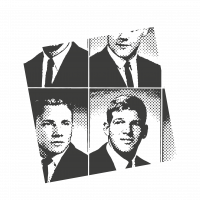
I used an old yearbook photo to create a logo for this publication.

This logo was based on typefaces traditionally used for broadsheet papers.



This logo was based on typefaces traditionally used for broadsheet papers.



We also created a discreet logo for AMI, based on a coffee mug ring to be used as a watermark.